Sean Tilley has been a part of the federated social web for over 15 years and is covering news, updates, and profiles in this space through We Distribute. They have already seen success with their coverage and investigations over the past year. With an interest in expanding the scope of the project, they sought help elevating their brand to be something more impactful and distinguished.
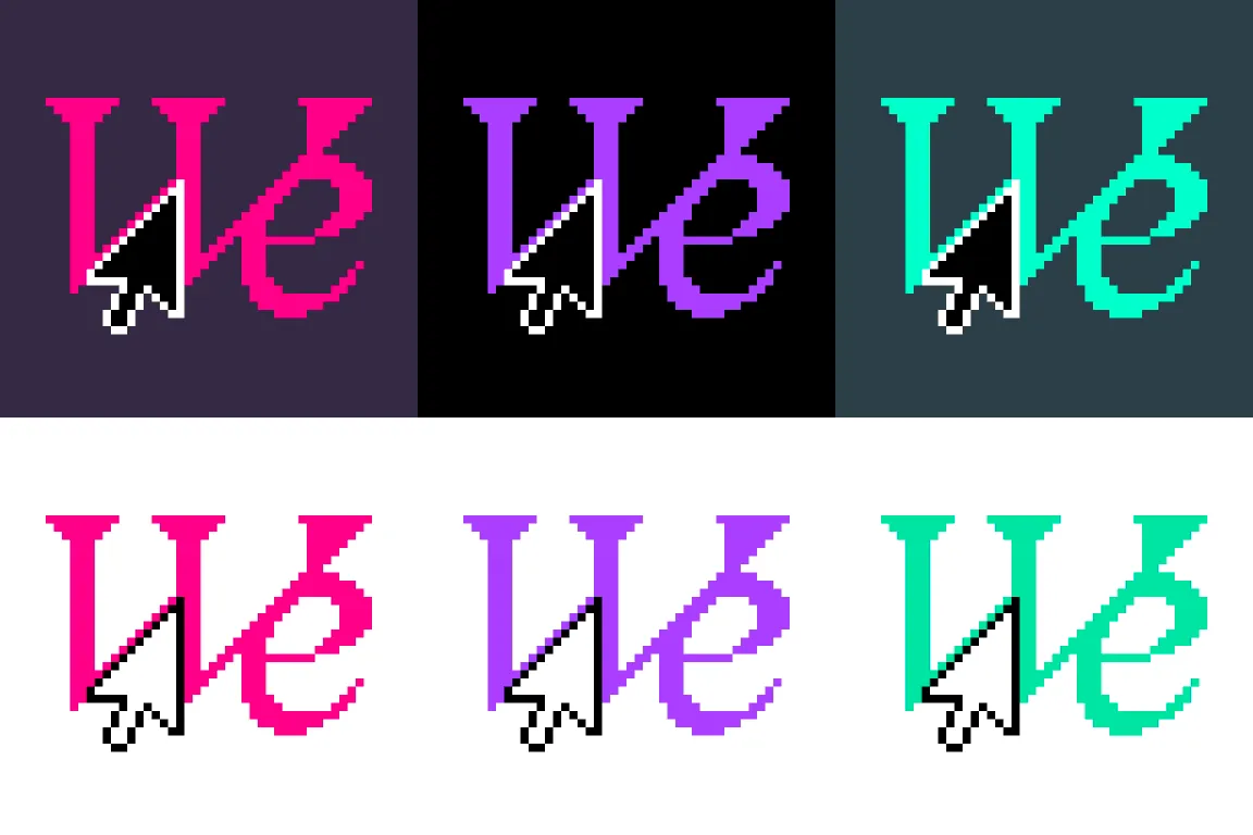
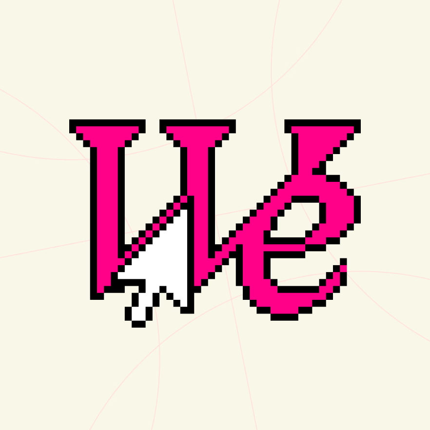
I worked with Sean and his business partner Damon to identify the goals of We Distribute, and where they needed it to stand out or fit into the competitive landscape. We identified the color and typography that other brands were using and crafted a look that distinguished itself from other publications while still feeling like a technology publication. We chose bright brand colors that steered away from the usual blue and purples of other tech publications and used contemporary serif fonts instead of usual sans-serif fonts. We leaned heavily on Redaction by MCKL Type and MoMA to provide a pixelated and digitally distressed aesthetic while remaining crisp and modern.


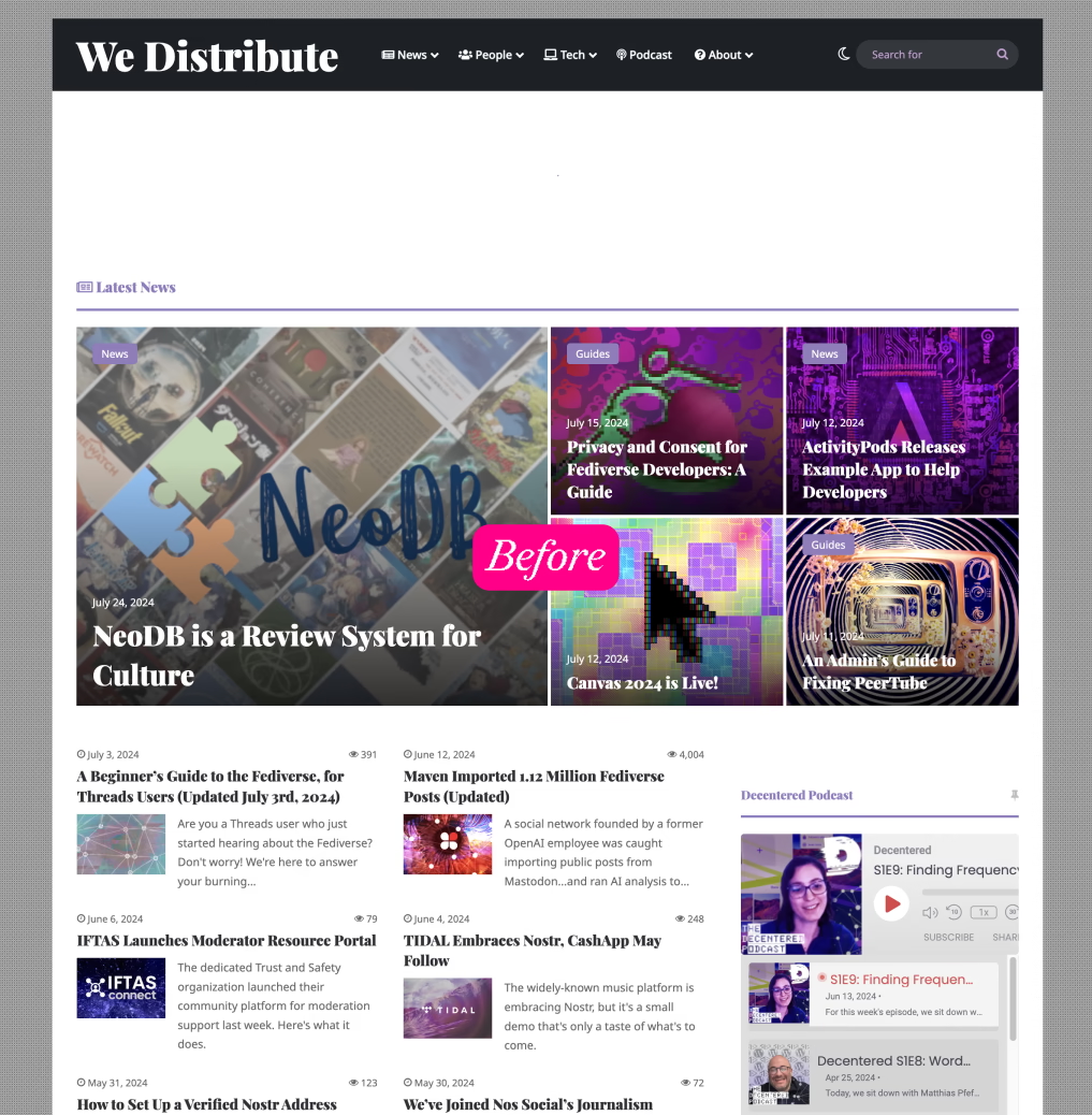
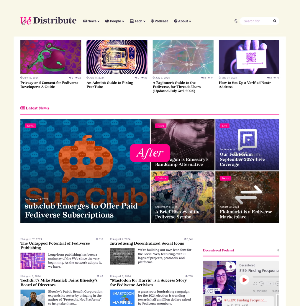
After solidifying the brand for both We Distribute and their podcast Decentered, we re-themed their WordPress website to incorporate the new brand. Quickly making the website feel fresh and contemporary to use and interact with.


I am extremely excited about the results of this redesign. We Distribute now has a more own-able brand that will aid in audience growth and retention. This project is still ongoing and we will continue to update this post with more details.
-
I absolutely love the work you’ve done with us. We Distribute looks so good thanks to your thoughtfulness and skillful approach.
Sean Tilley, Founder

