We love Roslindale by David Jonathan Ross, so when he approached us to design a specimen site to showcase the font’s rich design characteristics and history we jumped at the opportunity. We worked with David to scaffold a rough outline of the microsite and André Mora to draft content.
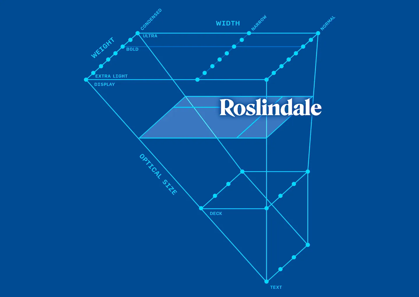
The design space of Roslindale is something we wanted to highlight. David visualizes this space as a triangular prism, a shape we dubbed “the horn”. It shows how widths stem out as optical size increases, creating a richer and more complex area for large type. We created an interactive version of this horn so that people could navigate around the design space, gaining a better understanding of how Roslindale works.

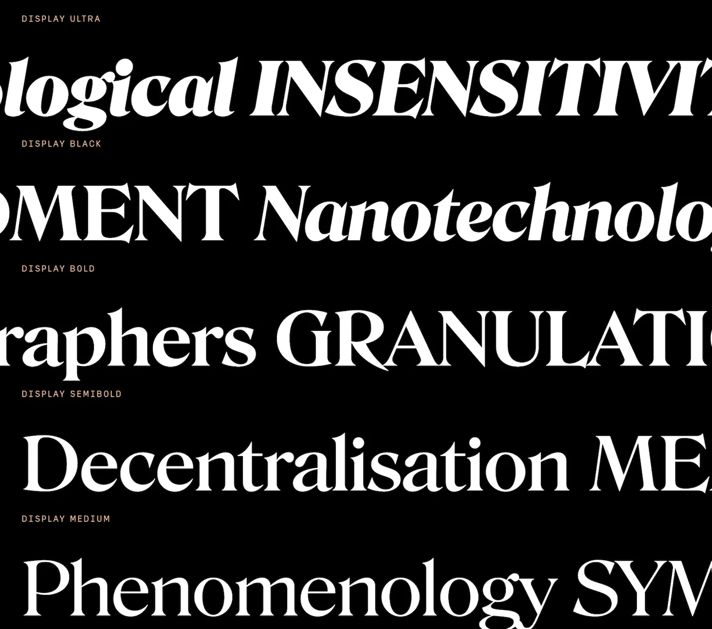
Interspersed within the sections we wanted to create a more traditional specimen. With all the styles available, we had the roman, italic, and uppercase variations scroll past when moving down the page while still being editable.

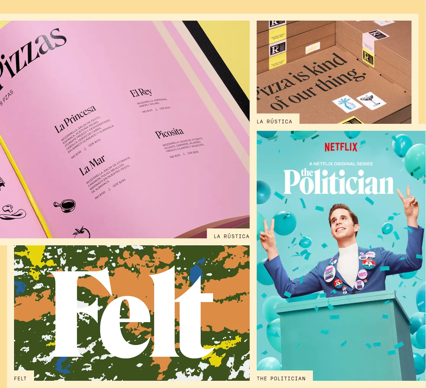
With the popularity of Roslindale, there was no shortage of in-use material to pull from. For this, we created a rich grid of images linking back to Fonts In Use. It’s one of our favorite parts of the design with an editorial yet visuals-forward aesthetic.

Visit the Roslindale specimen website

