A New Social offers a bold new vision for social media: a vision in which you can control how and where you connect with your friends online. Their first product, Bridgy Fed, allows you to talk and interact with accounts across Bluesky and Mastodon, but the vision is bigger. I introduced the concept of “constellations,” where unique networks intertwine to create a single image. These constellations enable people to connect with you, and enable you to connect with others across multiple networks. Each line in a constellation is a bridge.
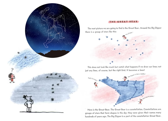 Reference material, predominantly sourced from Margret and H. A. Rey illustrations
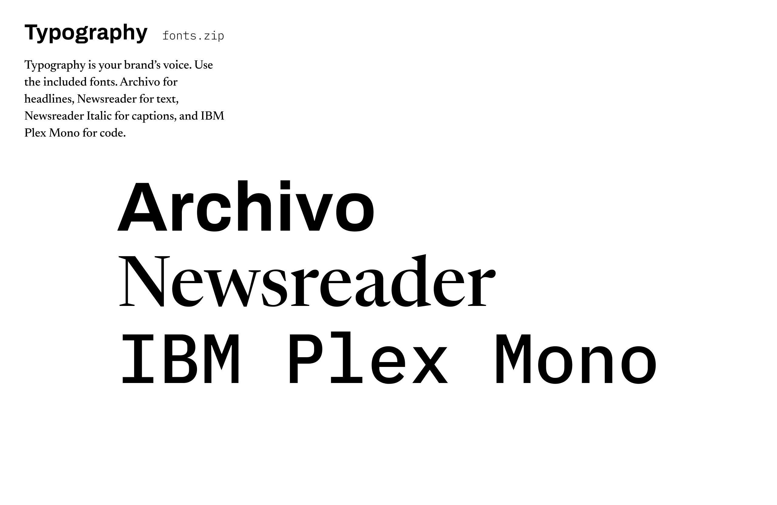
Inspired by the wonderous simplicity of Margret and H. A. Rey’s illustrations, I distilled a visual language incorporating star diagrams and a very warm and human aesthetic. I also explored typography treatments, settling on Libre Caslon for this iteration. It was important for the typography to be OFL licensed, not just for budgetary concerns, but to align with the open principles of A New Social.
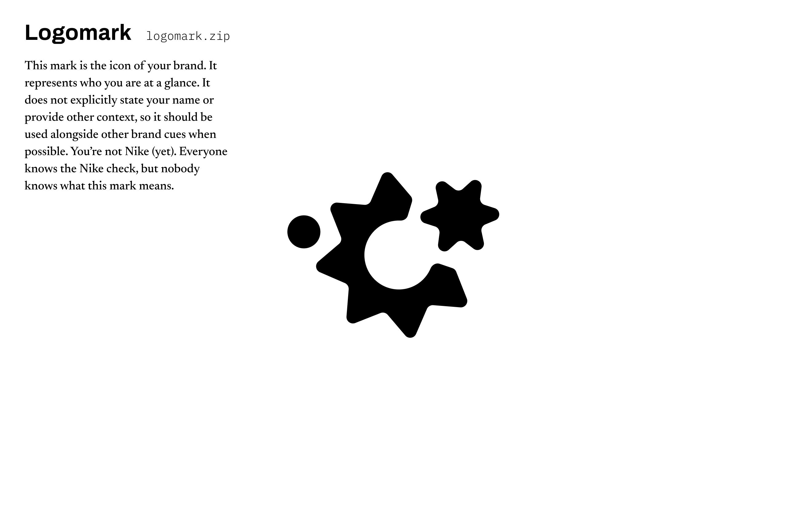
 A logo from the first round of brand ideation for A New Social
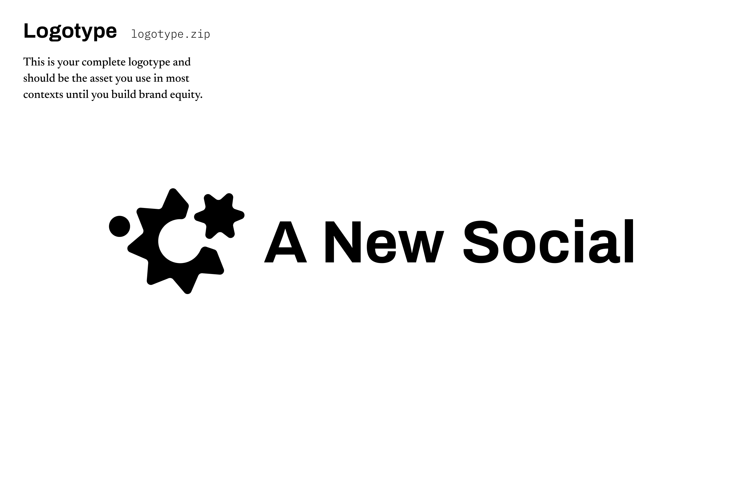
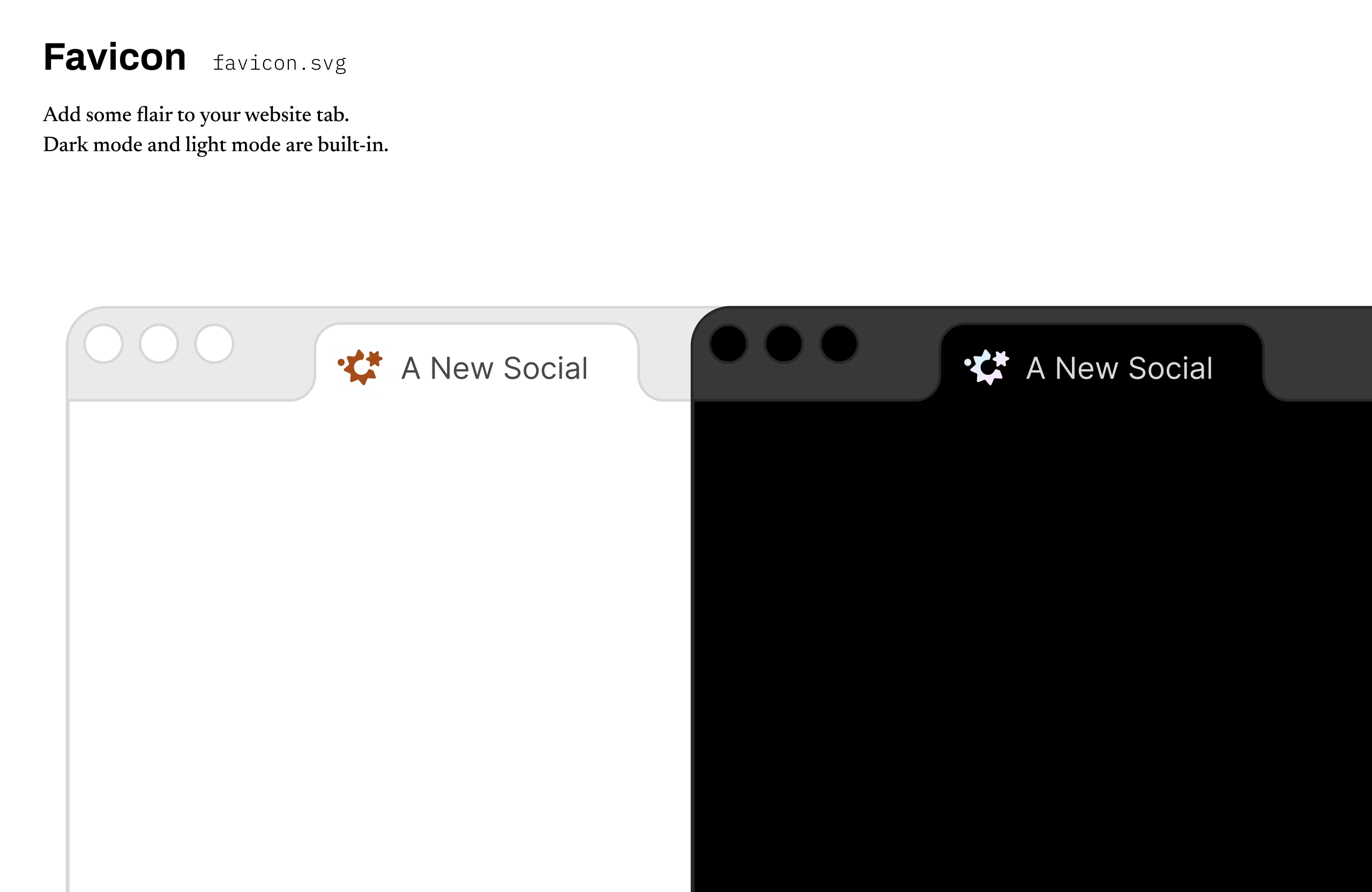
Another requirement is that this iconography needs to work across platforms and networks. While the client loved the aesthetics and flavor of this branding, it would stand out on platforms where we might want it to blend in to become a part of an existing interface. We needed something that would work as an icon and a logo. A tighter logo mark, and typography that is more common.
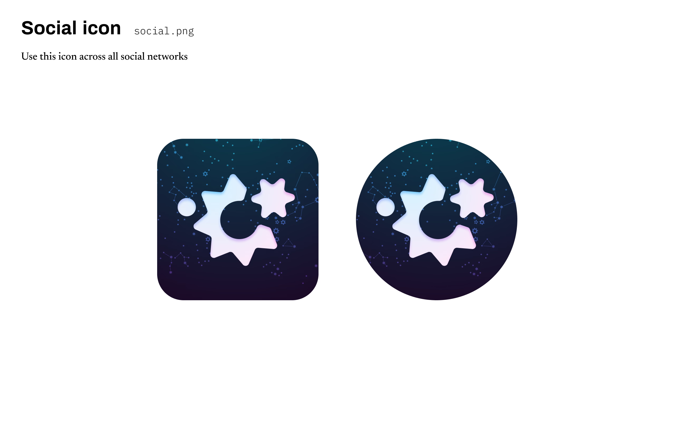
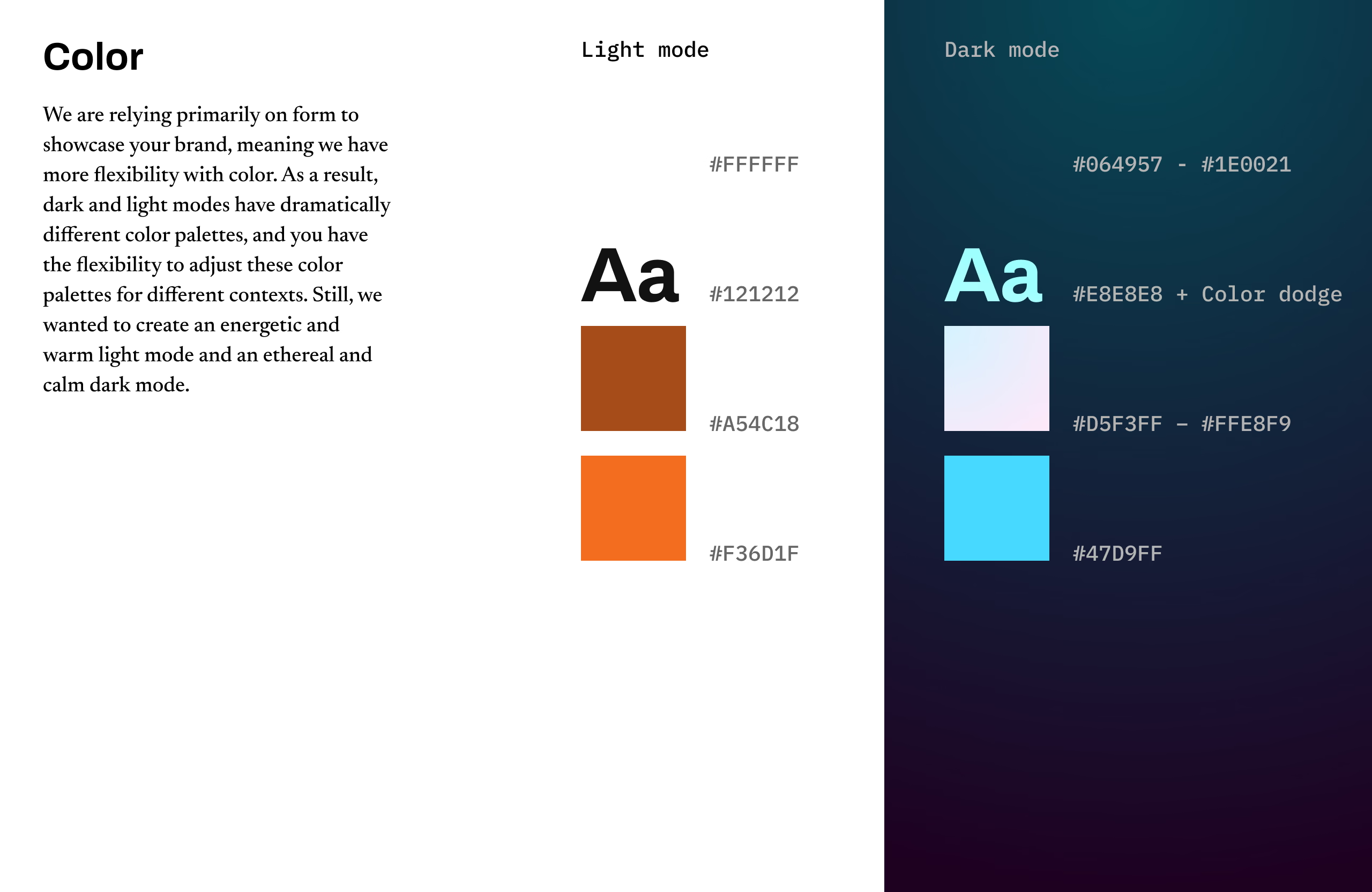
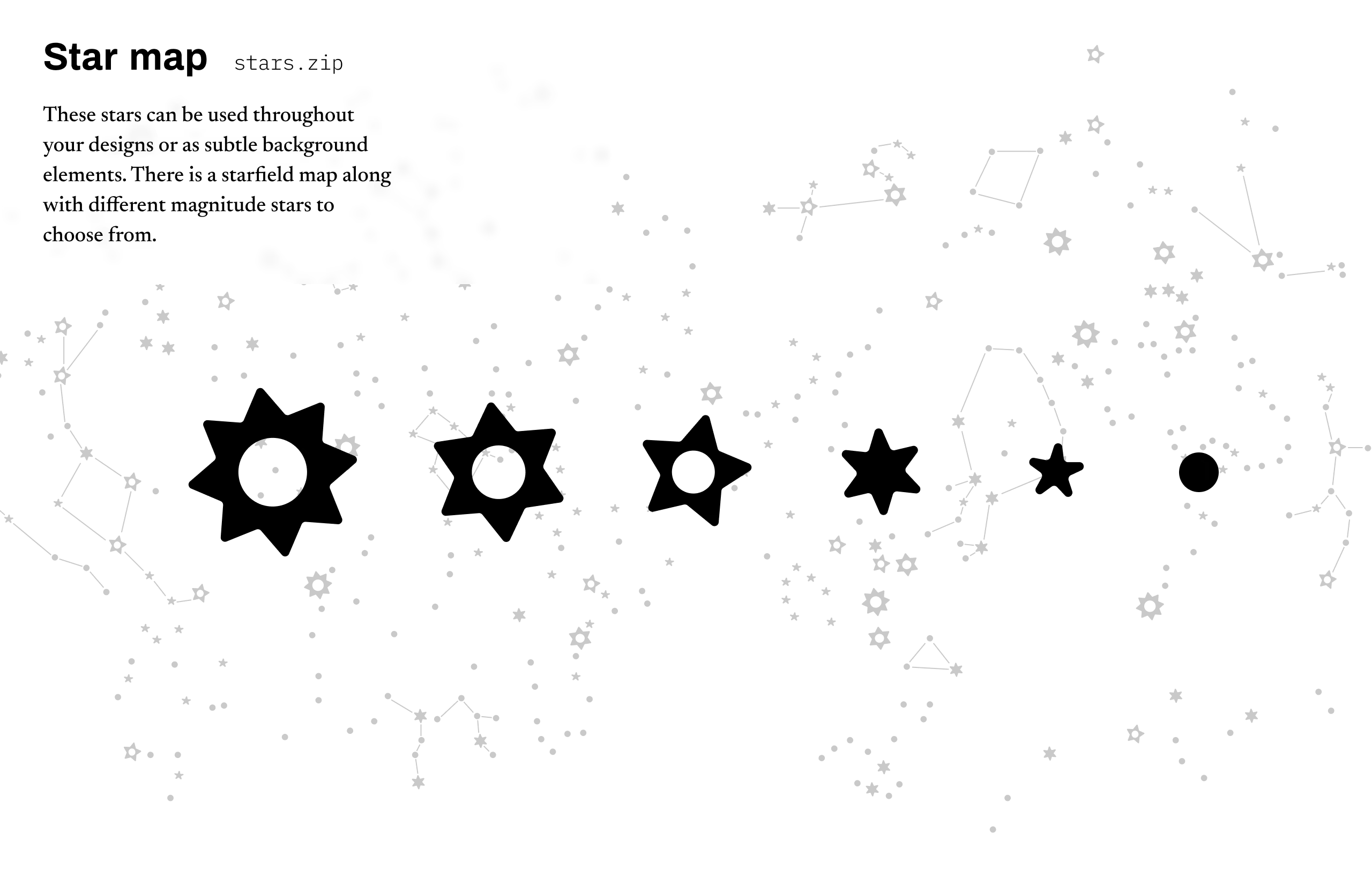
After more iterations, I played with bringing the stars closer together, overlapping the celestial bodies to eclipse each other’s form partially. This resulted in an icon at home in a button within an app or work as a logo atop a website. I also cast aside color schemes, relying on shape alone to forge the identity. The consequence was more flexibility with brand colors, enabling dramatically different light and dark mode color schemes, using warm oranges for light mode and cool blues and purples for dark mode. I also created assets like a constellation map that can be incorporated into designs, building depth and complexity.
The resulting brand guidelines enabled A New Social to launch a platform that connects people across networks. With their board recently announced, there is still work to be done. This effort establishes a solid foundation and brand identity to support that work.
-
I obviously loved what you made for us, but the process was definitely my favorite part. Can’t wait to work with you again in the future!
Anuj Ahooja, CEO & Executive Director